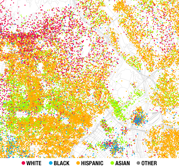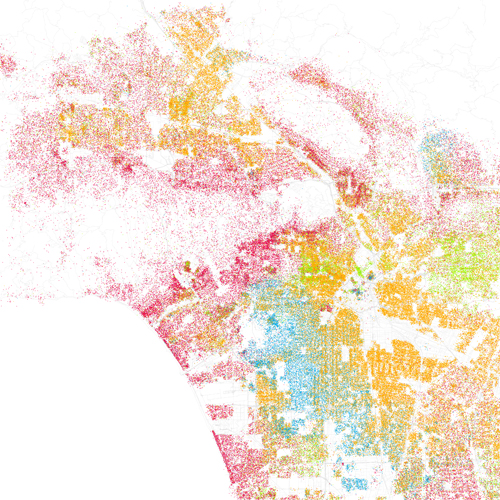
Photographer Eric Fischer was inspired by a Chicago map created by Bill Rankin that displayed the city’s racial and ethnic divides. He created maps of other cities like New York City, Houston, and Los Angeles using the same techniques Rankin did, applying date from the 2000 census. I took the Los Angeles map and zoomed in on the Echo Park area. Red is White, Blue is Black, Green is Asian, Orange is Hispanic, Gray is Other, and each dot equals a total of 25 people. For some perspective, the little empty round area near the middle of the above graphic is Dodger Stadium.
You can check out the rest of the Los Angeles map by clicking here or on the image below. You’ll notice… there are a lot of white people on the west side!

